
eCommerce Gaming App
Jan 10, 2026
15 min read
Overview
Gamer’s Choice
eCommerce Gaming App Design
Role: UX Designer, UI Designer, UX Researcher (Speculative work for Google UX Certification)
Duration: December 2025 – January 2026
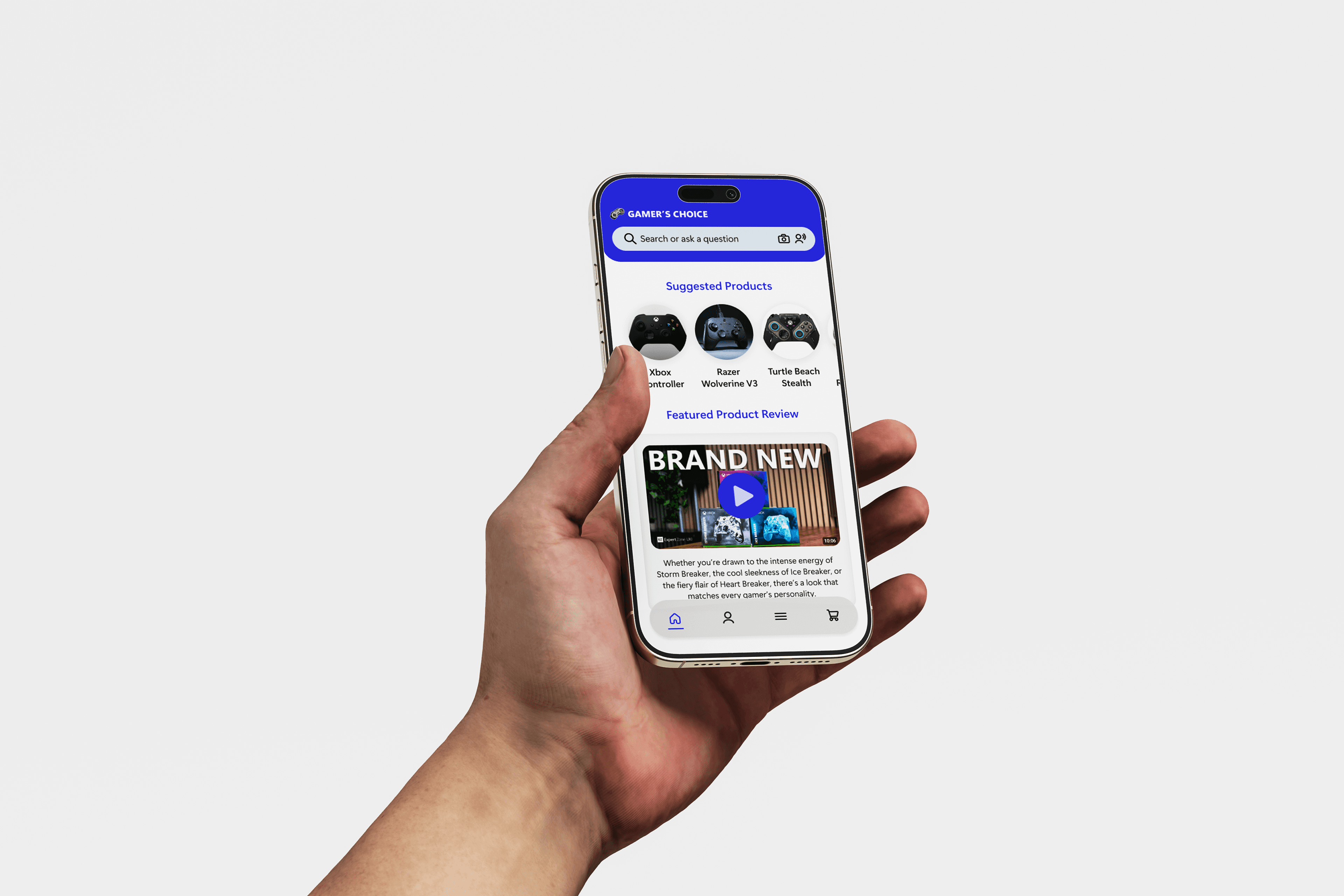
I designed a mobile-first eCommerce experience that helps gamers confidently purchase gaming equipment. Especially users who feel overwhelmed by product specs, compatibility, and technical terminology.
The Problem
Many users struggle to choose the right gaming equipment due to:
Overwhelming product options
Lack of clear technical specifications
Difficulty finding trustworthy reviews
Poor accessibility filtering
Beginner gamers and gift buyers especially felt unsure about what to purchase and often relied on word-of-mouth instead of reliable product information.
The Goal
Design a simple, intuitive shopping experience that:
Reduces decision fatigue
Surfaces trusted reviews and video content early
Supports accessibility needs
Helps users confidently complete checkout within a few steps
Research
Design a simple, intuitive shopping experience that:
Reduces decision fatigue
Surfaces trusted reviews and video content early
Supports accessibility needs
Helps users confidently complete checkout within a few steps
User interviews
I conducted 5 moderated usability interviews with participants in Seattle and Portland.
Participants were asked to:
Find an Xbox controller
Review product details
Complete checkout to confirmation
Key insights
Through user testing and feedback:
Users wanted clearer technical specs
Filtering options were limited
Video reviews were preferred over long text
Persistent navigation was important
Accessibility-focused products were difficult to find
Persona
Kevin - Competitive Gamer
Kevin replaces his controller every 6–12 months due to stick drift. He wants durable equipment and fast access to reliable reviews.
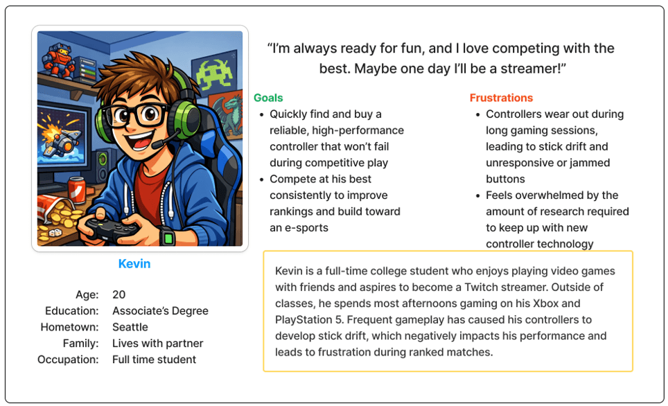
Maria - Parent Shopping for Accessibility
Maria needs a controller that supports her daughter’s motor function challenges. She struggles to find accessibility-focused devices quickly
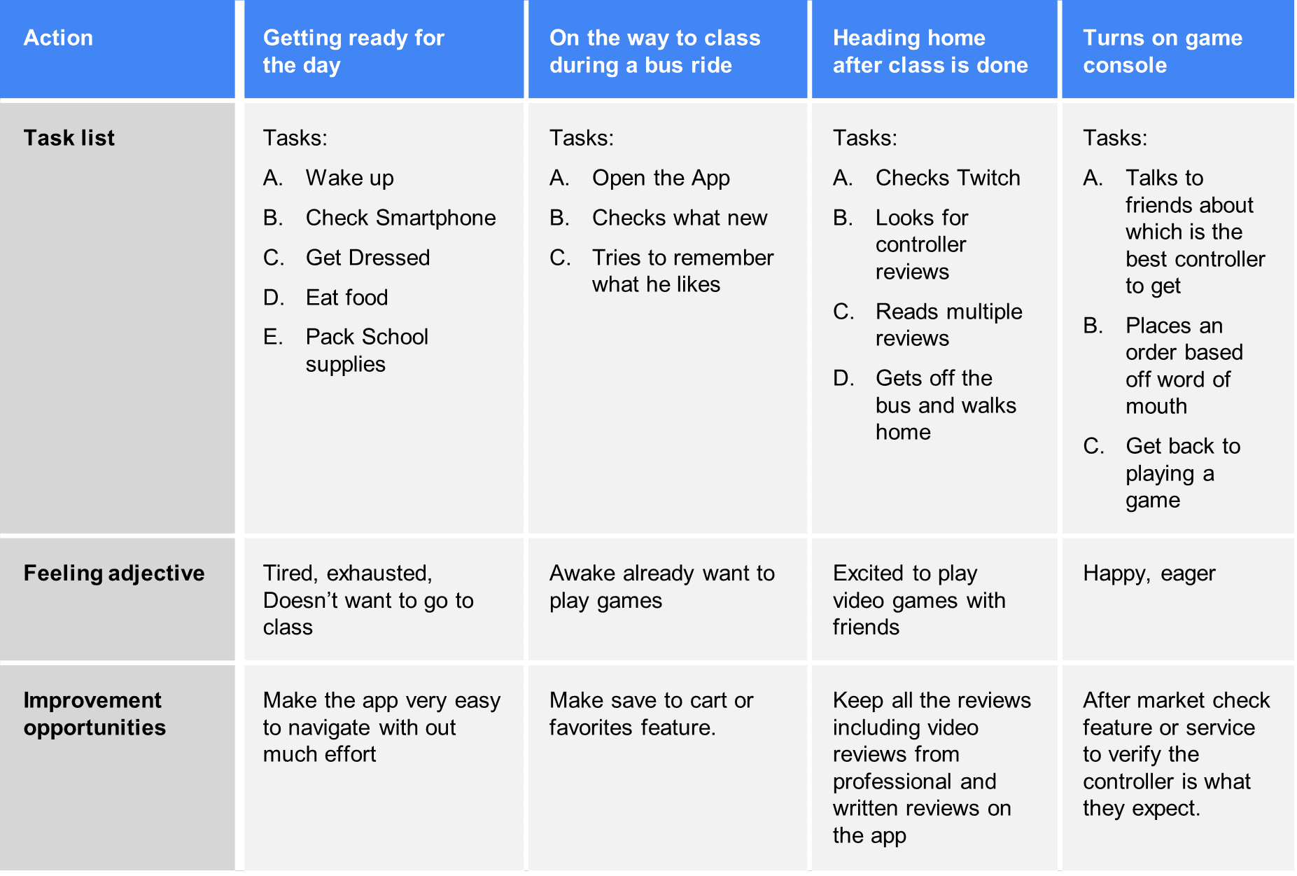
Opportunities for improvement included:
Save-to-cart / favorites
Smart search functionality
After-purchase reassurance
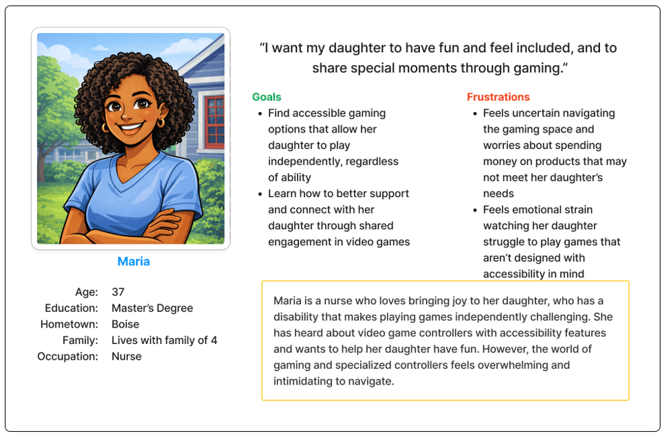
User Journey
These personas influenced prioritizing:
Discover a product within 4–6 actions
Compare specs and reviews easily
Move through checkout without friction
Feel confident in their purchase
Opportunities for improvement included:
Save-to-cart / favorites
Smart search functionality
After-purchase reassurance
Design process
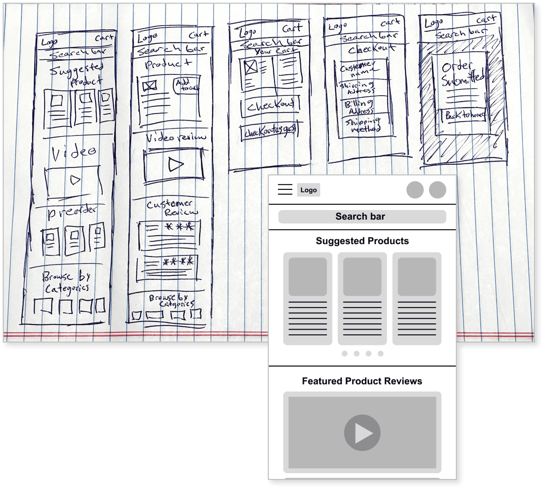
Wireframes
Paper wireframes focused on broad product exploration and flexible navigation.
Digital wireframes introduced:
Smart search (voice, image, suggestions)
Featured video reviews
Suggested products for beginners
Clear category structure
The goal was to reduce friction while supporting discovery.
Usability testing
Two rounds of testing led to key improvements:
Before Testing:
Small icons
Limited filtering
Crowded layouts
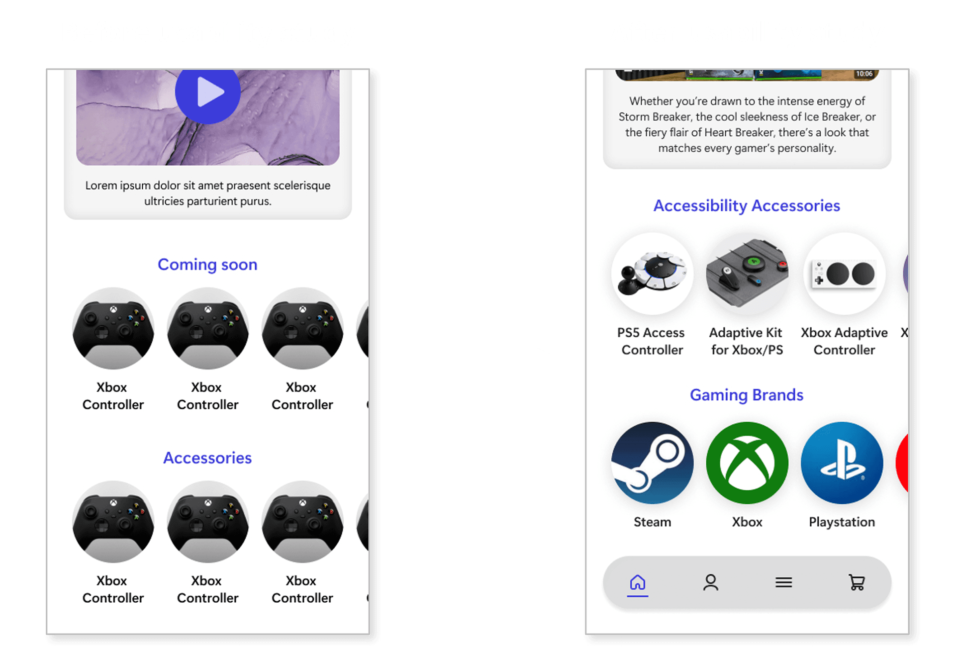
After Testing:
Larger touch targets
Expanded filtering categories
Persistent bottom navigation
Improved spacing for clarity
Users responded positively to video content and simplified layouts.
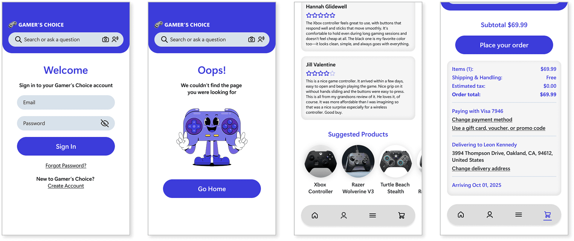
High-fidelity design
The final prototype includes:
Clear search functionality
Accessibility category placement
Persistent bottom navigation (Visible in prototype)
Prominent “Place Order” hierarchy
The interface focuses on confidence, clarity, and ease of use.
Accessibility
Accessibility was prioritized throughout the design:
Buttons sized for touch accuracy
Minimum 16pt body text
WCAG AAA color contrast standards
Clear layout hierarchy
Accessibility was not treated as an add-on, but as a foundational design principle.
Impact
All participants were able to:
Locate desired products
Complete checkout successfully
Discover new products categories
Navigate with fewer clicks
Users especially appreciated:
Video reviews
Expanded filtering
Clear controller specs
What i learned
Core findings included:
Many users rely on marketing over technical understanding.
Too many visual elements increase decision fatigue.
Accessibility visibility builds trust.
Iteration improves clarity more than adding features.
Next steps
Key improvements moving forward:
Refine micro-interactions
Add subtle animation for guidance
Expand accessibility education content
Introduce post-purchase comparison tools