

Harvestloop App
Mar 8, 2026
15 min read
Overview
Harvestloop
Food Rescue for Small Businesses and Food Banks
Role: UX Designer, UI Designer, UX Researcher (Speculative work for Google UX Certification)
Duration: February 2025 – March 2026
I design a mobile application that allows small business owners to list surplus food in under 60 seconds, while enabling local non-profits to claim and coordinate pickups in real-time. We will measure success by the reduction in end-of-day food waste for participating businesses and the increase in fresh food donations received by local shelters over a 6-month period."
The Problem
Food goes to waste while shelters go without.
How might we create a seamless way for businesses to list surplus food and for local organizations to claim and collect it in real-time? Current processes rely entirely on manual phone calls and text messages — inefficient, inconsistent, and stressful during closing rushes.
The Goal
60 seconds to donate. Real-time pickups.
Design a mobile application that allows small business owners to list surplus food in under 60 seconds, while enabling local non-profits to claim and coordinate pickups in real-time. Success is measured by the reduction in end-of-day food waste and the increase in fresh food donations received by local shelters over a 6-month period.
Research
A gap the market hasn't filled.
A competitive audit of platforms like Too Good To Go and Olio revealed that while existing apps focus on consumer discounts or neighbor-to-neighbor sharing, there is no professional, streamlined service specifically for business-to-NGO donations. Current processes are handled through phone calls and texts — manual, inconsistent, and one-off.
Manual Coordination
Communication between businesses and shelters is done via phone calls or texts, rarely part of a scheduled, recurring pickup process.
Policy & Liability Fears
Smaller businesses worry about food allergy liability. A Good Samaritan Act splash screen could reassure donors they are legally protected.
Time-Consuming Listings
Listing items during end-of-day rushes is burdensome. A scannable printable PDF or quick-entry form could drastically reduce friction.
No Donation Tracking
Businesses lack visibility into the monetary value of their donation, a tax deduction dashboard could provide a clear annual savings view.
Persona
Marco · Bakery Owner · Donor
A busy, community-minded bakery owner who wants to donate his daily surplus but finds manual outreach too time-consuming during closing shifts leading to good food being thrown away.

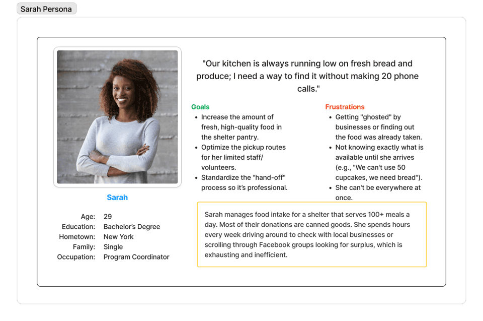
Sarah · NGO Program Coordinator · Recipient
A resource-constrained NGO coordinator who needs a real-time, centralized way to track and claim fresh food. Current reliance on Facebook groups and private channels leads to missed pickups.
User Journey Maps
Every minute matters at closing time.
The journey maps reveal a narrow, high-stress window where both users need the app to work — quickly, reliably, and with no friction.
Marco journey map
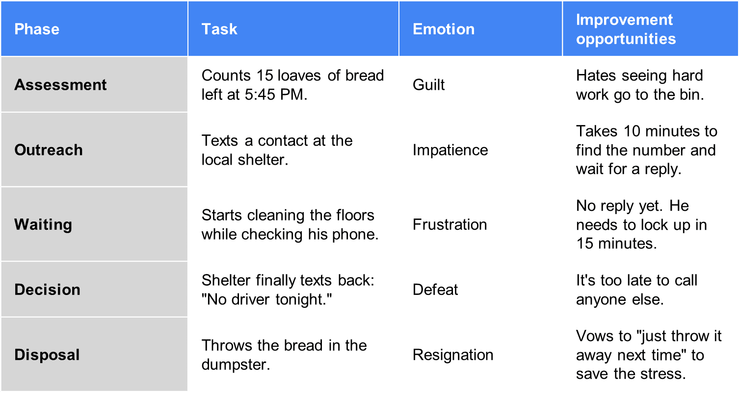
Sarah journey map

Design process
From sketch to system.
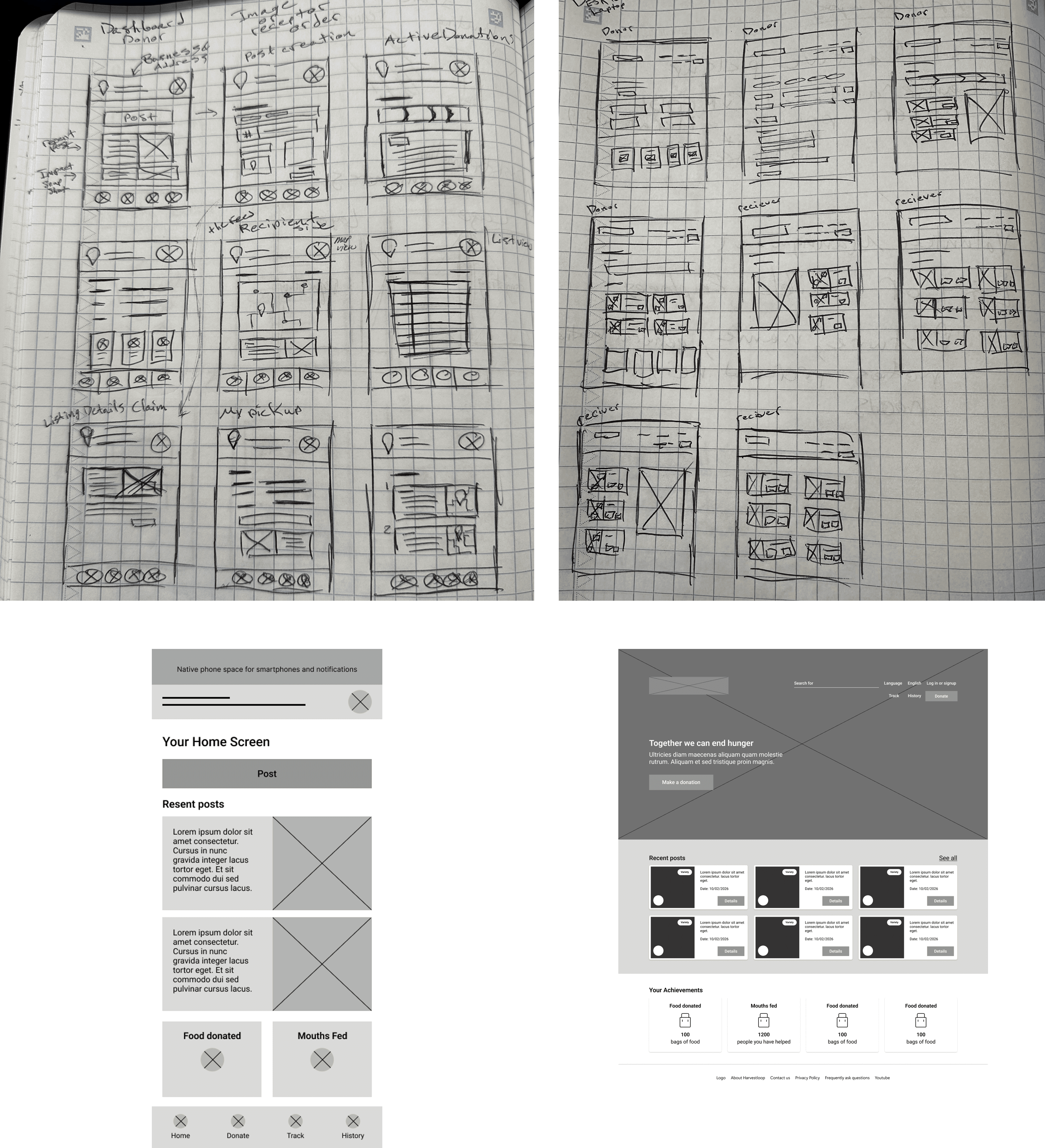
Guided by user research and journey maps, the design moved through multiple fidelity levels - always prioritizing a mobile-first, intuitive experience for users with busy lifestyles.
Digital Wireframes
Refined the user flow for both mobile and web. Introduced the quick-donate CTA button and dual-portal (donor / recipient) dashboard.
Low-Fi Prototype
Built to test user flow, validate functionality, and identify accessibility improvements before committing to high-fidelity design.
Usability Study
Two rounds of unmoderated remote testing with 5 participants across the United States, each session 10-30 minutes long.
Usability testing
Two rounds, clear improvements.
After analyzing the usability study, findings were synthesized into specific, actionable design problems. Users responded positively to the distinct donor/recipient portals but flagged navigation clarity and button emphasis as issues.
Round 1 - What worked
Users appreciated the clear split between donor and recipient portals.
Color coding helped users differentiate between app sections.
Overall flow from listing to confirmation felt logical and quick
Round 2 - What needed fixing
Navigation elements were too small - touch targets needed to be larger.
It was difficult to tell which portal (donor vs. recipient) you were currently in.
Buttons lacked visual weight and needed more emphasis to guide action.
High-fidelity design
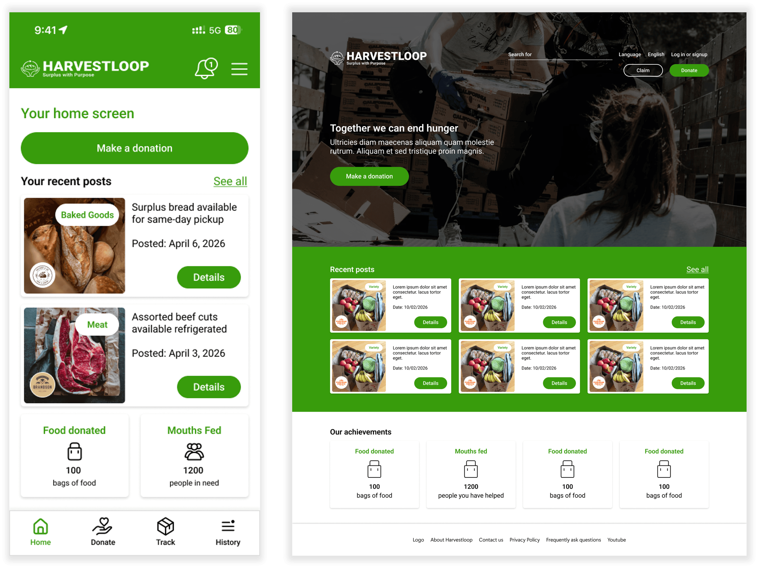
Clarity, confidence, and green.
Brand Color System
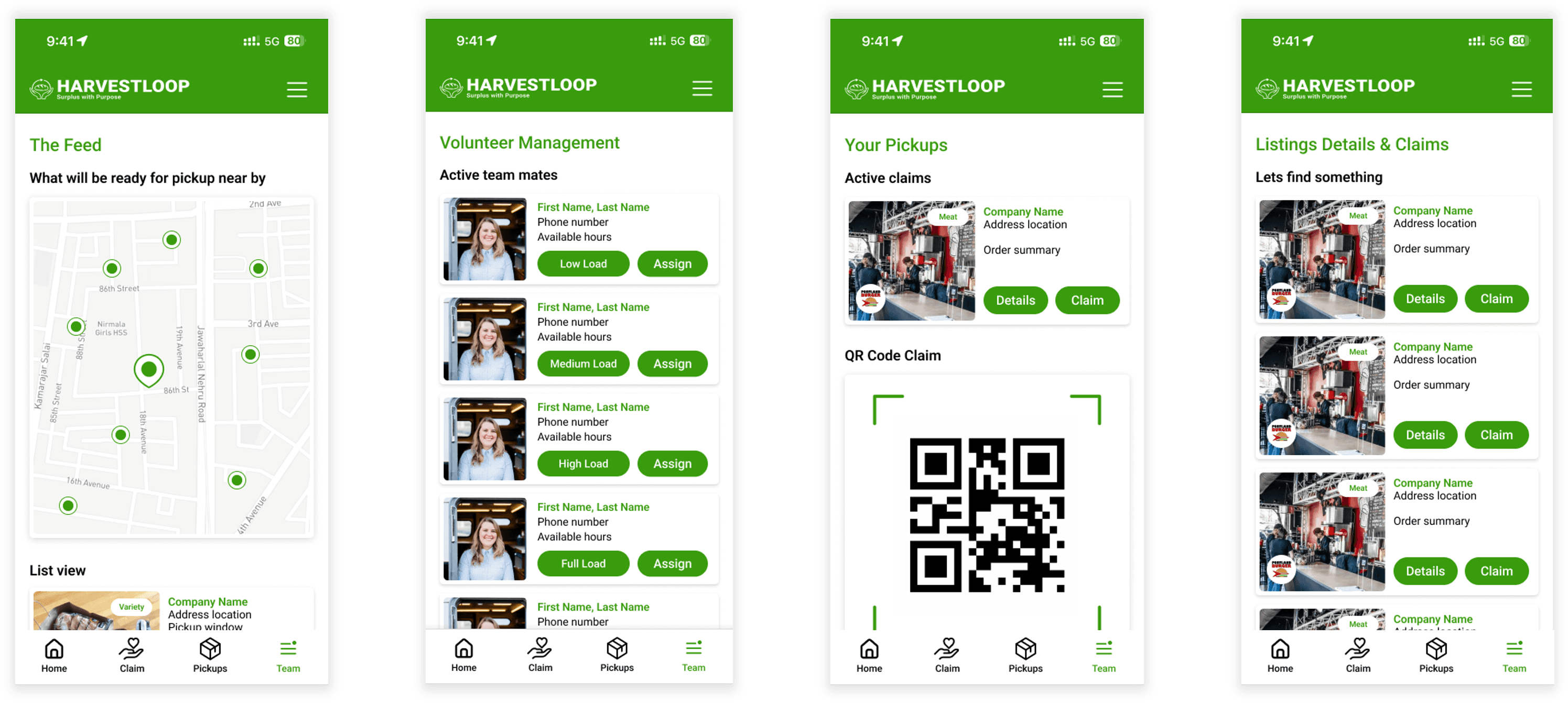
Green chosen to reflect the brand ethos of reuse and repurpose, used to convey critical actions and available states at a glance.
Smart Donation Tags
Applied tags during the donation process add at-a-glance info - allergy notes, quantity, expiry - reducing back-and-forth communication.
Persistent Navigation
Consistent bottom navigation across all screens lets users orient themselves and switch modes without losing their place in the flow.
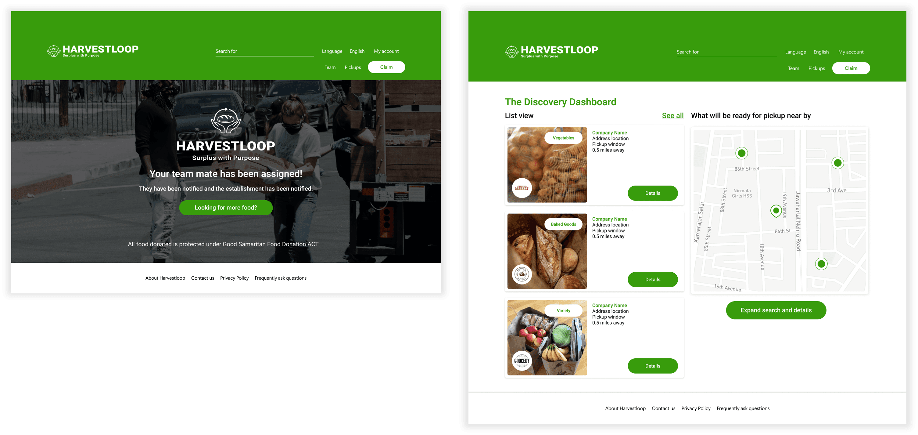
Responsive Web Version
A desktop-format layout mirrors the mobile experience with enhanced visibility for NGO coordinators who prefer larger screens.
Accessibility
Built in from the start.
Accessibility was not treated as an add-on but as a foundational design principle, considered at every stage from wireframing through final prototype.
WCAG AA Contrast
Primary colors meet WCAG AA contrast standards, keeping text clear and readable across all device brightness levels.
Consistent Hierarchy
A consistent visual hierarchy lets users move through the app naturally, with reduced cognitive load and clear navigation paths.
Roboto Typeface
Roboto chosen as the primary font for consistent rendering across mobile, web, and desktop - no additional installations needed.
Impact
HarvestLoop streamlines how donors and recipients connect - enabling fast, secure food distribution even without an account. Organizations benefit from built-in communication and team management tools.
Reduces friction for business-side donations
Real-time availability for NGO coordinators
Scalable to new regions and food types
Donation value tracking for tax deductions
What I Learned
Multiple usability studies at different stages reveal far more than a single round. Direct engagement with users and local businesses provides deeper insight than data alone.
Iterating on communication reduces confusion more than adding features
User protection features (Good Samaritan Act notice) build trust at onboarding
Real-world constraints (closing-time stress) must shape interface speed
Two-sided platforms need distinct visual identity per portal
Next steps
Animations & Micro-Interactions
Incorporate subtle animations and micro-interactions to make the experience feel more responsive, alive, and trustworthy for first-time users.
Responsive Breakpoints for Web
Create multiple breakpoints for the website version to ensure the experience holds up across tablets, large monitors, and everything in between.
Partner with Real Stakeholders
Reach out to food banks, local bakeries, and NGO coordinators to bring HarvestLoop from a certification project to a real-world product.